Task 3 : Merchandising & Promotional Item
30/10/2024 - 16812/2024 (Week 6 - Week 13)
Tiffany Tan Xuan (0362472)
Packaging and Merchandising Design
Task 3: Merchandising & Promotional Item
INSTRUCTION

TASK 3
This is a collaboration project between the Design School and School of Biosciences. Students from SBS has developed food in their previous semester and in need of packaging design for their product.
In this project, we will be required to create a new packaging design based on a collaboration project. The project aims to develop students' skills in creating and designing suitable packaging that reflects the product and its target audiences.
This task required us to design a packaging solution for a product created by the students from the School of Biosciences (SBS). The product was ready, but it needed a creative and functional packaging design that would make it appealing to its target audience. As a design student, I felt the pressure of balancing aesthetics with practicality, but I also saw this as a great opportunity to test my design skills.
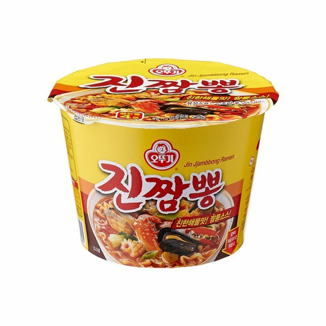
The first step was to understand the product. For me, it was a chicken-flavored instant noodle called Dak Gomtang. It’s a Korean-style soup flavor, and the name alone gave me an idea to focus on something that connects with Korean culture while keeping it fun and modern.
I started by researching Korean food packaging designs and observing how they use typography, color, and illustrations to reflect the flavor and cultural elements. I noticed that many Korean food products have playful, bold visuals and bright, eye-catching colors. This gave me a starting point for the creative direction.

When I first showed my ms these vibrant colours Korean designs, she said these colours looked unhealthy because during the SBS student presentation they said it was all about health, so she suggested me design it with earthy tones.
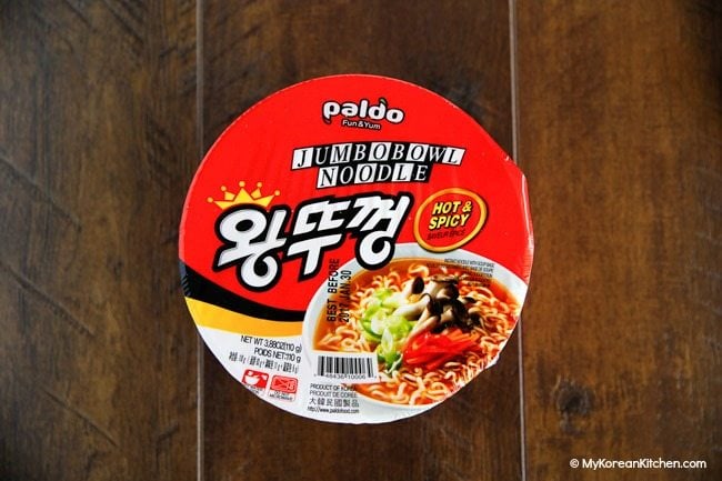
So I started looking for Korean instant noodle designs with earthy tones, but the designs turned out to be very boring.


So We asked these SBS students to send us their references so that we can have a look. This will help us design better and it will be easier for us to start thinking of ideas.
This is the reference given from the SBS students:https://pin.it/7xcToqFE7
Ex:


Once we had a rough idea of the visual style, we started sketching. We wanted the packaging to feel warm and comforting because Dak Gomtang is a hearty, traditional soup. At the same time, Angeline added playful elements to attract younger audiences, such as a cute chicken mascot.
Here are some of the ideas we explored during this phase:
- Using a chicken character eating noodles to add a fun, memorable visual.


- Choosing a red, blue, and yellow color palette to symbolize warmth (red), calmness (blue), and energy (yellow).

After the meeting, we started finalising the sketches, the SBS students choose this as their colour palette.


I moved to Adobe Illustrator to start digitalizing the design. This step was more challenging than I expected. we faced a few problems:
- Color Composition: We wanted to follow the colour palette that the SBS students have chosen, but it turns out the packaging too dull, totally not standing out.


After completing the first draft, I presented my design to Ms. Vitayaa and my classmates. The feedback I received was valuable:
- Ms. Vitayaa pointed out that the line is too thick
- Colour is too dull just like we thought


Ms. chooses the first colouring but she thinks that the line colour could mix around with black and white instead of just white colour.
At this stage, we included essential elements like:
- HACCP and GMP logos for food safety certifications.
- A clear nutrition label to inform consumers.


So this is our final cut noodle Dan Gomtang design for the collaboration with students of SBS. At last, we need to make a presentation to Dr. Neo and this moment I started doing the presentation slides.
In the final presentation slides, we included the mockups of the final artwork.

After completing the packaging design for the Dak Gomtang flavor cup noodles with the SBS students, we were facing the next challenge—designing merchandise and promotional Item. This time, we had to take our project a step further by expanding the product line and creating extra flavors as well as promotional items.
Before starting the designs, we brainstormed ideas as a group. Since the original Dak Gomtang flavor already had a fun, eye-catching theme with the chicken mascot, we decided to keep the playful tone and extend it into new flavors. We introduced two new cup noodle flavors:
- Spicy Dak Gomtang Flavor – a bolder, fiery twist for people who love spicy food. The chicken mascot was reimagined with a playful, ‘spitfire’ expression to add humor. Chilli pepper illustrations added to make the flavour obvious.
- Tomato Dak Gomtang Flavor – a comforting and tangy option to appeal to families and kids. The chicken mascot happily holding the tomato with tomato floating around. This gave the design a cheerful and comforting vibe.


Ive done the colour picking for the mascots and put them together to make all three flavours feel like part of the same series while giving each a unique look that reflected its personality.


At the same time, we brainstormed merchandise and promotional items that could help promote the product. After discussing ideas, we agreed on creating a fork and spoon set, chopsticks, a mug (inspired by Maggi), and an apron. These items felt practical and on-brand for cup noodles, since they are related to eating and cooking.


Step 2: Designing the New Cup Noodle Flavors
I started by sketching ideas for the two new flavors. My main challenge was making sure they matched the original Dak Gomtang design while still standing out. When I designed the tomato and spicy flavors of cup noodles, I felt like something was missing, but I didn't know what it was.


So I started trying different colors, and finally I found the one I was most satisfied with. Instead of using the colourful waves, I used bold reds, fiery orange tones, and flame-like patterns to highlight the spicy theme. For tomato version, I chose warm orange to reflect the tomato’s natural colors.


Once the cup noodle packaging was done, we moved on to designing the promotional items. We have changed some merchandise as we think that the chopstick and fork and spoon set couldn't really brings out the brand product. Each item had to feel connected to the product but also functional as merchandise. Here’s how we approached each item:


- how do you want to make a merchandise to make for ur brand's product
- need to be more creative (think out of the box)
- fridge magnet
- keychain
- cup noodle
- mug
- tote bag
- apron
- banner
- stand
- booth
FINAL ARTWORK SUBMISSION
Merch 1: Cup Noodle
Merch 2: Banner


Final Merch Compilation PDF
Final Presentation Slides:
FEEDBACKS
Specific Feedback: Experiment with integrating traditional Korean-inspired motifs into the packaging design for a more authentic appeal.
Specific Feedback: Utilize vibrant yet cohesive colours to represent the different flavours while ensuring the overall design feels unified.
REFLECTIONS
My journey in Task 3 has been a huge learning experience. In the packaging task, I explored how to create designs that not only looked good but also told a story about the product. With the merchandise task, I learned how to translate those designs onto real objects while maintaining consistency and functionality.
These projects pushed me to think creatively and work through challenges, from balancing bold designs with clean layouts to ensuring every detail aligned with the product’s overall branding. I’ve realised that design isn’t just about making something visually appealing—it’s about solving problems, telling stories, and creating experiences that connect with people.
A big thank you to the friendly Ms. Vitiyaa for her guidance and support throughout this project. Your feedback helped me refine my ideas and pushed me to think more critically about my designs. I truly appreciate your patience and encouragement as I navigated the challenges of this task. >3<

The book provides practical advice and guidance for typographic decisions, making it valuable for both beginners and experienced designers. Bringhurst's writing style is engaging and informative, making it an enjoyable read for anyone interested in typography and design.

"The Elements of Typographic Style" is widely considered a must-have resource for anyone working with typography, from graphic designers and typographers to writers and editors. It is a timeless reference that will help you develop a deeper understanding and appreciation for the art and craft of typography.
Comments
Post a Comment